Go to market teams are investing without visibility into what's working
Teams invest in strategic initiatives — training programs, plays, conversation frameworks — but have no reliable way to know if any of it is actually working.
Are reps doing what they're supposed to do? Are they having the right conversations? Is it moving revenue?
The gap isn't in strategy. It's in visibility.
A three-phase loop: Define, Configure, Track
The product mirrors how GTM teams naturally think about running an initiative — articulate what you're doing, set up what success looks like, then watch it unfold.
Fix what's broken, scale what's working.
Define
Articulate the initiative and its strategic intent
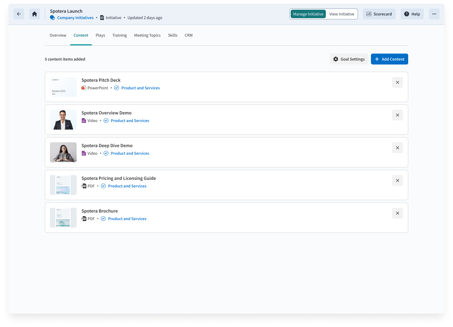
Configure
Set goals and select the activities you want to measure
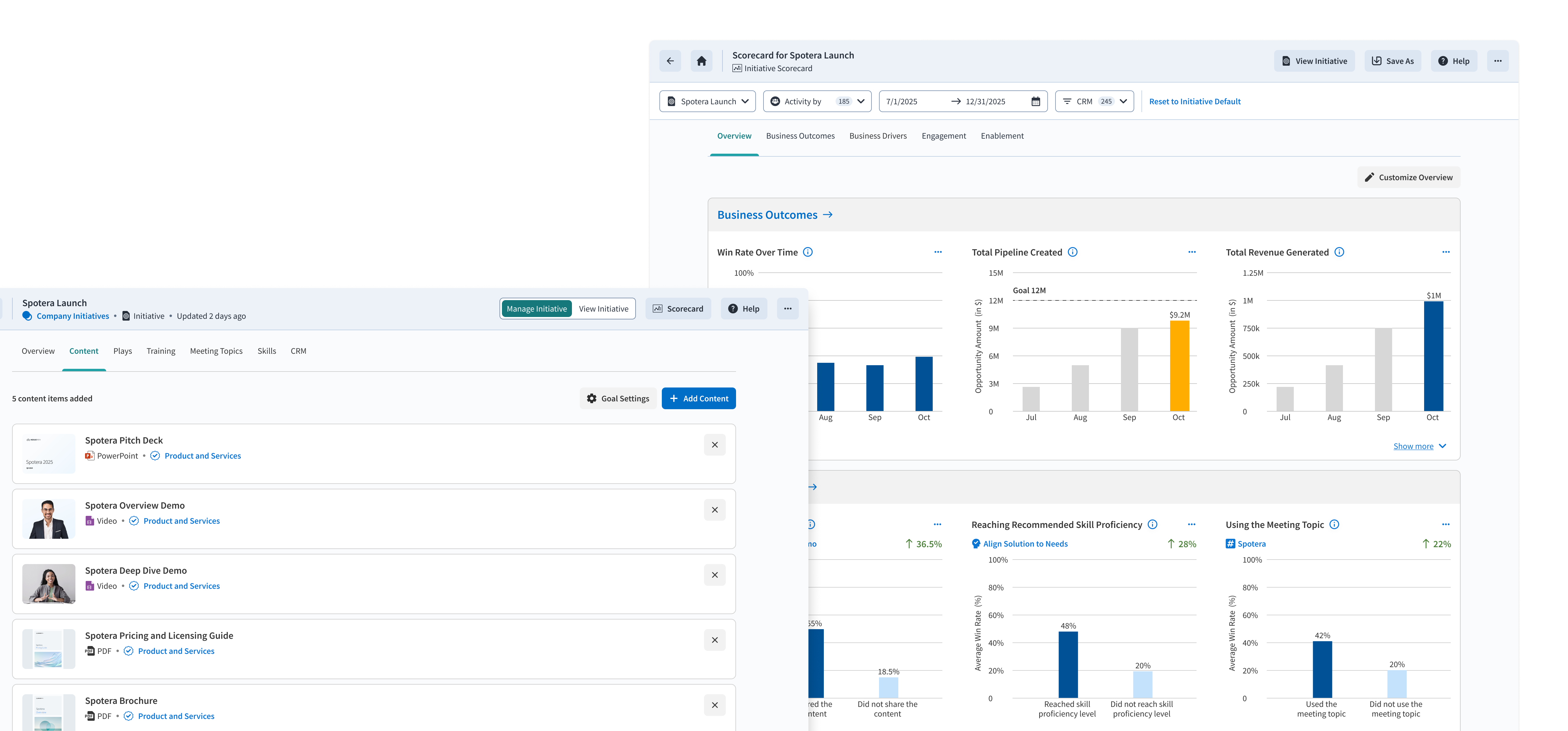
Track
Monitor progress through a live dashboard
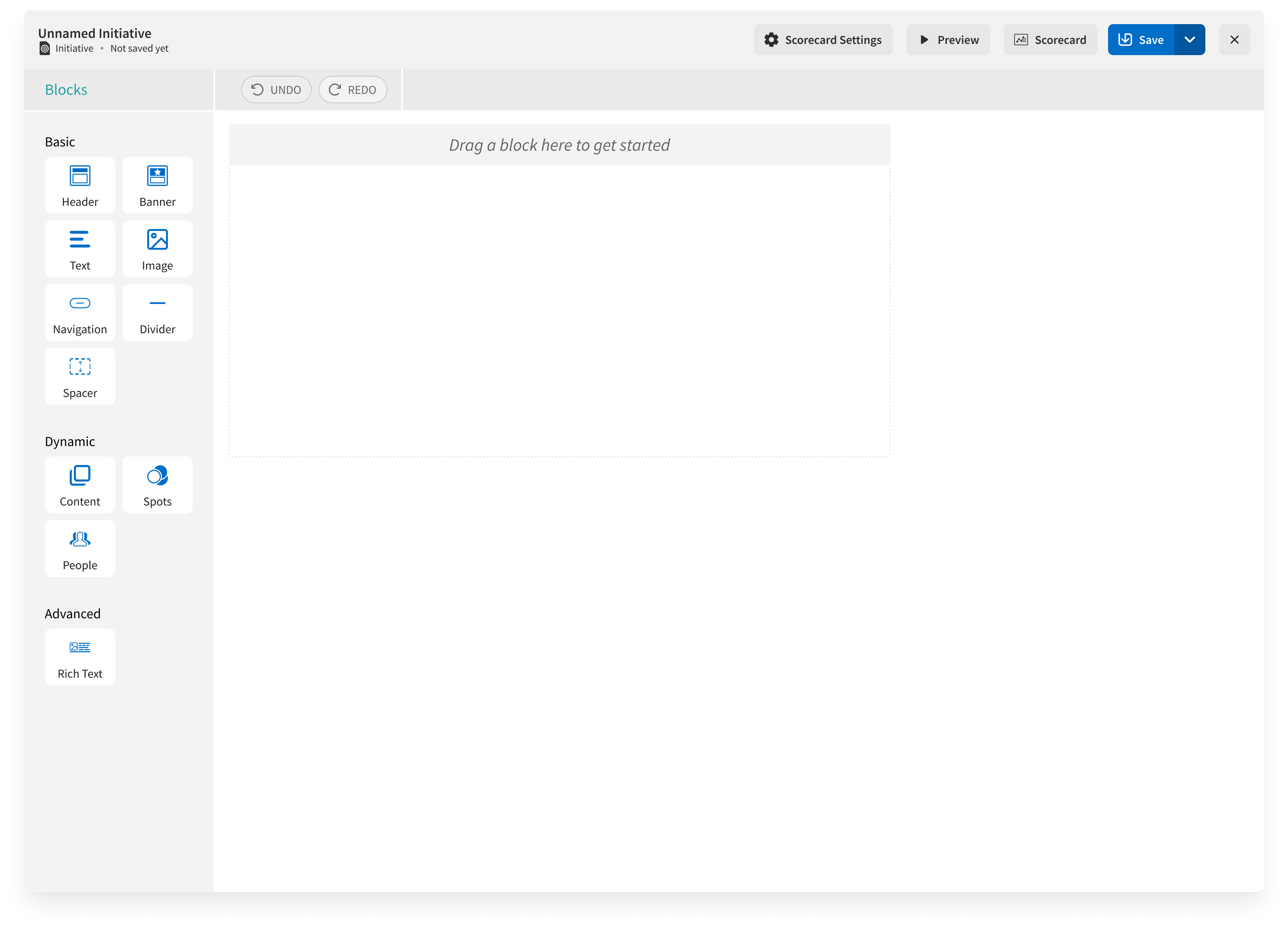
Before — open WYSIWYG editor
After — structured drag-and-drop scaffolding
A blank slate created friction where we expected freedom.
We started with a WYSIWYG editor. Open-ended flexibility was supposed to let leaders articulate intent freely. Instead, people got absorbed in designing the layout rather than thinking about outcomes.
Feedback from 10 customers in our pilot program made the problem concrete:
Initiative owners said a blank slate was an overwhelming starting point
Did not expect to define the initiative in the WYSIWYG editor at all
Liked the WYSIWYG experience due to familiarity, but needed a template to reduce the number of decisions to be made
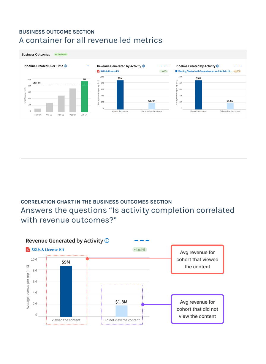
Business Outcomes section — original framing
The correlation metric was hard to understand.
The scorecard introduced the metric that could answer the question "Is completing an activity correlated with higher revenue outcomes?". The metric would help team diffrentiate high and low impact activities.
Customer feedback highlighted that the metric was valuable but hard to understand:
Customers understood the metric before it was explained to them
Loved the metric once they understood it
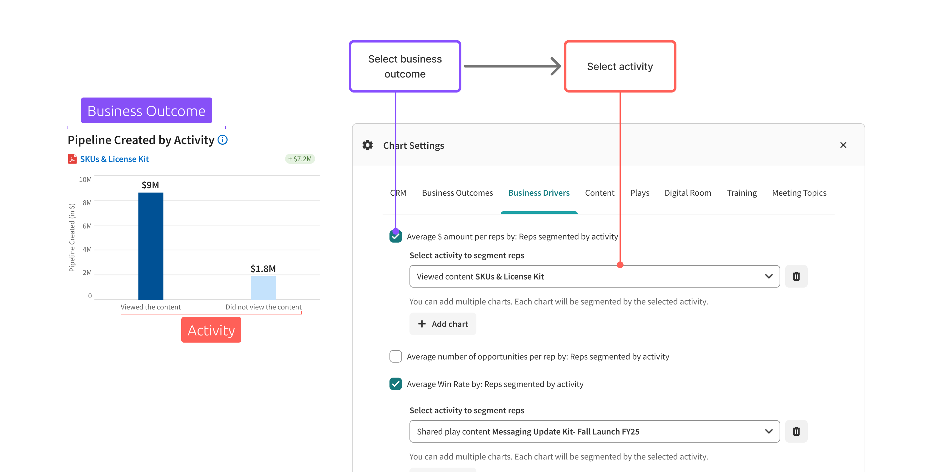
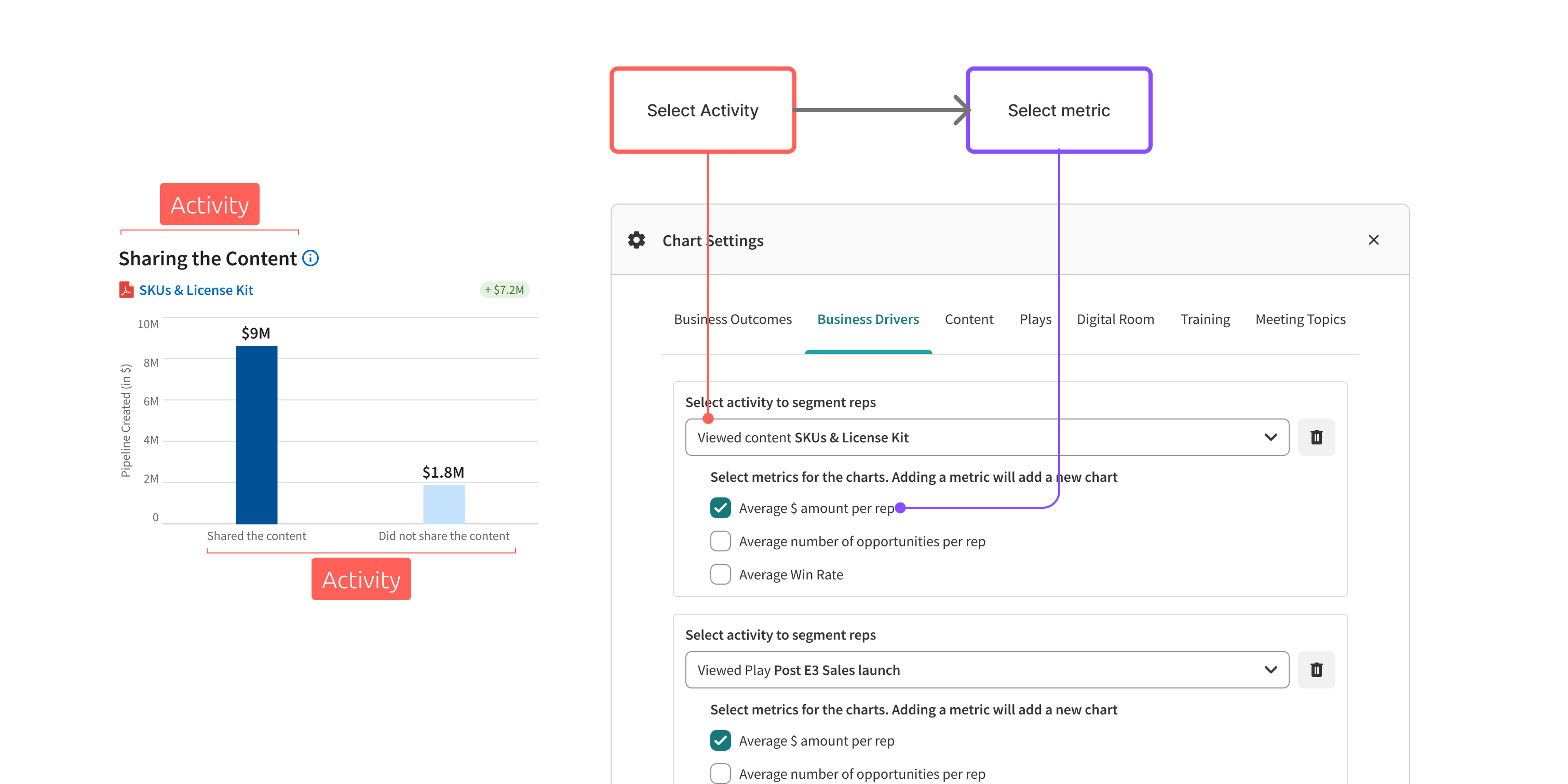
That gap — between zero comprehension and universal enthusiasm — wasn't a data problem. It was a framing problem. The metric was buried in a "Business Outcomes" section, with the activity as footnote text beneath the revenue headline. The cause was buried beneath the effect.
Evangelism was our workaround. Renaming the section to "Business Drivers" was the fix.
Correlation is not just a stat, it's a story
"Business Outcomes" → "Business Drivers" sounds like a copy change. It wasn't. It flipped the entire mental model — with cascading consequences on chart labels, configuration flow, and how customers read the data.
| Business Outcomes | Business Drivers | |
|---|---|---|
| Model | Revenue leads, activity is context | Activity leads, revenue is proof |
| Chart reads | Avg. revenue: did vs. didn't | For this activity: revenue difference? |
| Configure flow | Pick metric → pick activity | Pick activity → revenue surfaces |
Before — "Business Outcomes" framing
After — "Activity" framing
Final product — causal chain dashboard
A causal chain GTM leaders can act on
The product now tells a sequential story — not just a dashboard with numbers, but a logic that leaders can follow from behavior to conversation to revenue impact.
Training behavior
Are reps completing activities to build the right skills?
Customer conversations
Are they having the expected conversations?
Revenue correlation
Is completing that activity correlated with higher revenue?
Initiative performance
Is the initiative hitting its revenue goal in aggregate?